

Goals:
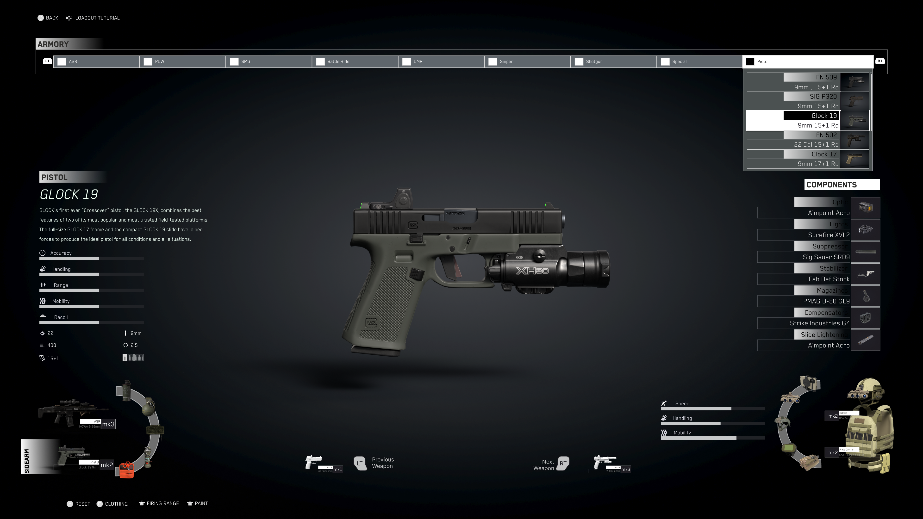
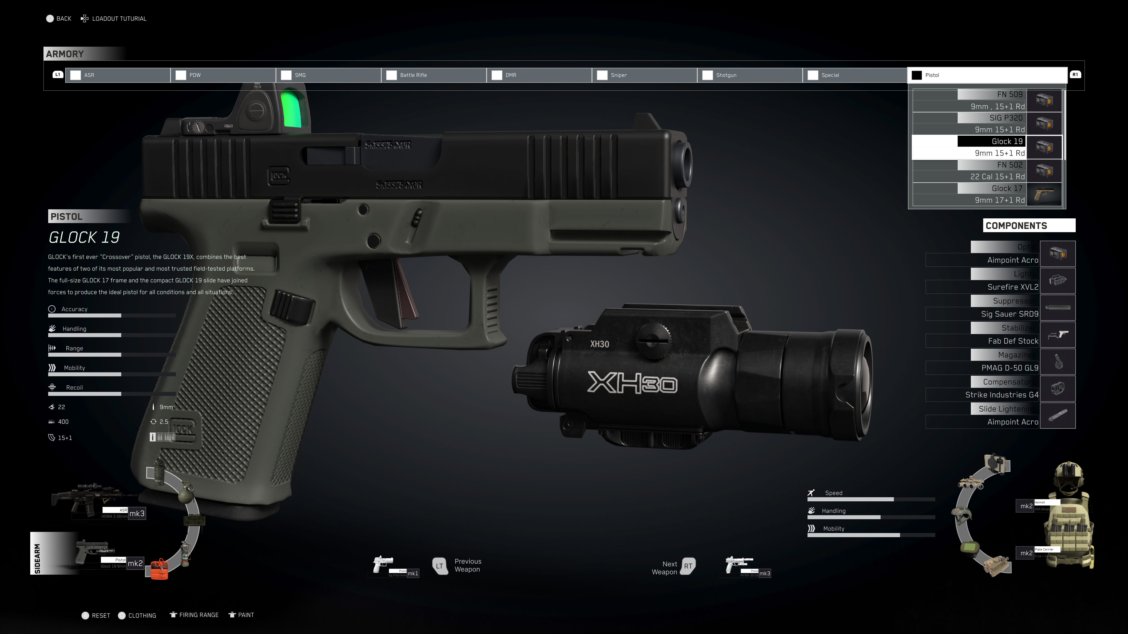
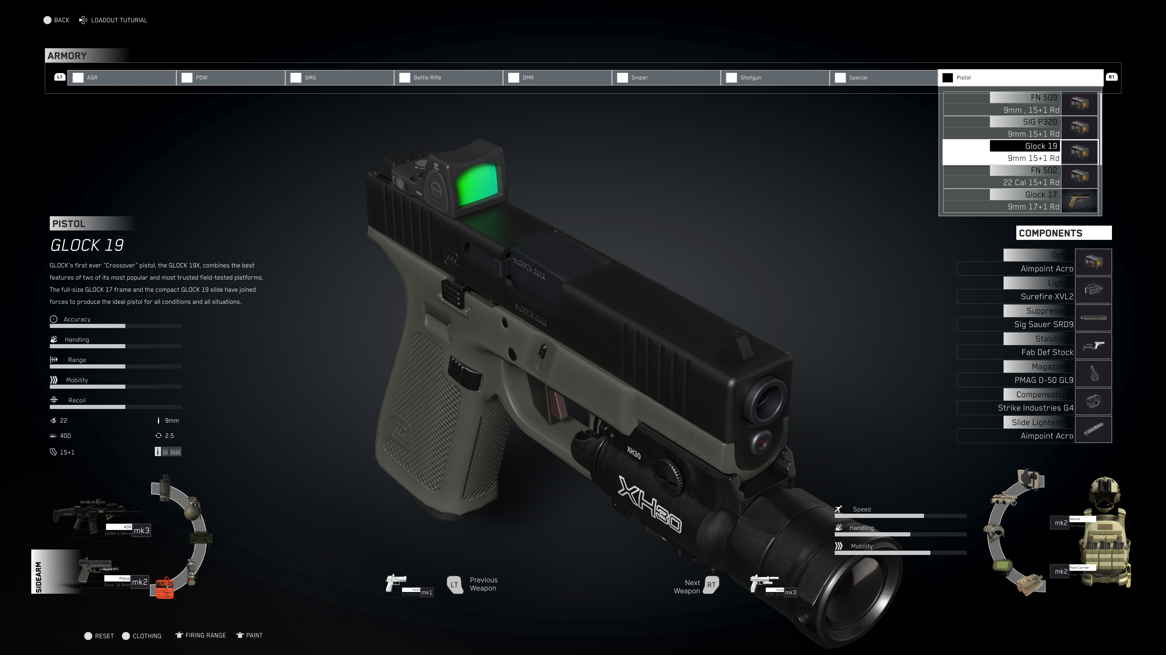
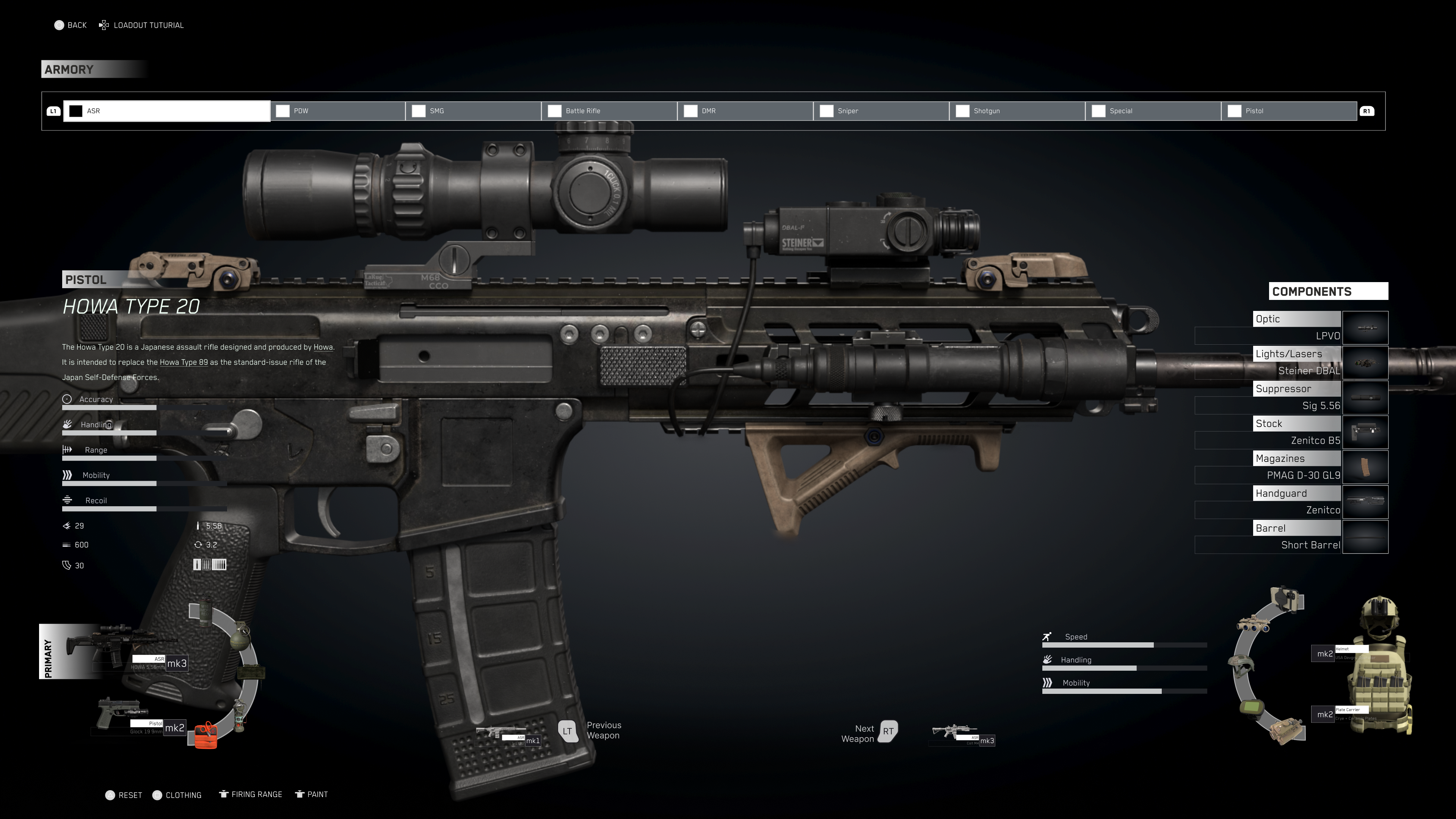
To effectively showcase my UI and UX design abilities, I chose to enhance an existing game by implementing the following improvements:
- Streamlining the current weapons, loadout, and kit pages into a unified armory screen.
- Crafting an Armory screen with intuitive navigation for quick analysis and controller-friendly interaction.
- Introducing contemporary attachments and features to pistols and rifles.
- Enriching the Ghosts' arsenal with near-future and modern kit items, while phasing out less popular gear from Breakpoint.
- Balancing underpowered ASRs and OP SMGs by introducing various ammunition types, such as 77 grain 5.56, 300 BLK, subsonic, and supersonic rounds.
- Incorporating gear weight as a factor affecting the Ghosts' mobility and handling.
Important notes:
The work presented is not a showcase of finalized assets but rather an initial UI/UX mockup designed for stakeholder feedback.
While the design does consider certain style options and fonts, it does not encompass the full spectrum of secondary and tertiary colors found in a finished style guide, leaving room for further implementation.
The 3D models utilized are not custom-made or game-ready but were sourced from freely available resources and rendered to align with the style frames.
I allotted myself 48 hours to complete this task over a weekend, primarily because I find value in staying productive.

